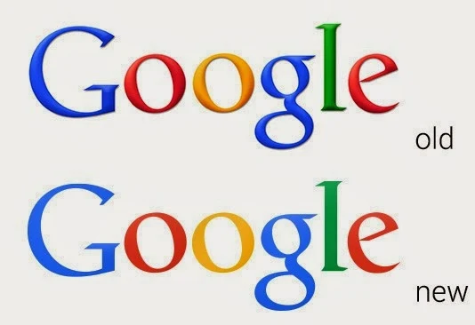
Google introduces new 2D logo
The search engine giant Google, which makes an estimated profit of $430 billion annually introduced it's new logo today. The changes made are very subtle-
- The logo is changed from 3D to 2D.
- The colours are muted just a little bit.
The new logo was used since many years in advertisement banners. So, it's not entirely new.
Google's new logo is slick and neat.
What do you think of the tweaked logo? Will it make any difference?
I hope the world can handle this change.


I dont not when changed from 3D to 2D.
ReplyDelete